
It’s fascinating to hear central bankers talk about the economy, because in the span of a few seconds they can say so many things that simply aren’t supported by the evidence. For anyone planning to watch the confirmation hearings for the next Fed Chair, the evidence below is provided as something of a leash to restrain the attacking dogma.
There’s a lot of ground to cover this week – the Phillips Curve, quantitative easing, the Fed's bloated balance sheet, the “wealth effect,” the misguided "dual mandate," and the largely unrecognized bubble in stock prices. We have a Federal Reserve relentlessly pursuing a “trickle down” monetary policy that has weak economic effects, thin historical support, and ominous implications for future investment outcomes and the stability of the financial markets. So let’s get started.
The Phillips Curve
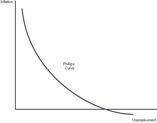
Consider first the notion of the “inflation-unemployment tradeoff” – the so-called Phillips Curve. Part of the reason that investors fall for this idea so easily is that many of them learned it from a nicely drawn diagram in some economics textbook. Like the one below. The idea is that as the unemployment rate rises, inflation falls, and as unemployment falls, inflation rises. The belief in this tradeoff has become so dogmatic that economists often comment about how we might intentionally target a higher rate of inflation in order to bring the unemployment rate down. Nice, clean diagrams lend themselves to such simplistic and dogmatic thinking.
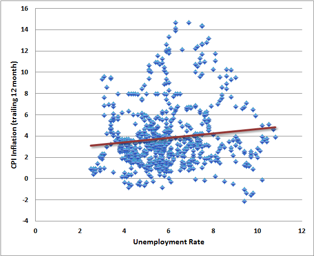
Below is what the actual data look like, depending on exactly how the proposed relationship is stated.
The first chart shows the relationship between the unemployment rate and the most recent year-over-year inflation rate. The relationship isn’t even downward sloping, but more importantly, it’s extraordinarily noisy. The clean curves presented in textbooks are so much more convenient.
The next chart is what people have in mind when they think of low unemployment causing inflation, and high unemployment as causing deflation. The chart shows the unemployment rate versus the CPI inflation rate one year later. Again, the relationship slopes the wrong way, but is in any case an insignificant relationship lost in a cloud of noise.
Continue reading here.
There’s a lot of ground to cover this week – the Phillips Curve, quantitative easing, the Fed's bloated balance sheet, the “wealth effect,” the misguided "dual mandate," and the largely unrecognized bubble in stock prices. We have a Federal Reserve relentlessly pursuing a “trickle down” monetary policy that has weak economic effects, thin historical support, and ominous implications for future investment outcomes and the stability of the financial markets. So let’s get started.
The Phillips Curve
Consider first the notion of the “inflation-unemployment tradeoff” – the so-called Phillips Curve. Part of the reason that investors fall for this idea so easily is that many of them learned it from a nicely drawn diagram in some economics textbook. Like the one below. The idea is that as the unemployment rate rises, inflation falls, and as unemployment falls, inflation rises. The belief in this tradeoff has become so dogmatic that economists often comment about how we might intentionally target a higher rate of inflation in order to bring the unemployment rate down. Nice, clean diagrams lend themselves to such simplistic and dogmatic thinking.
Below is what the actual data look like, depending on exactly how the proposed relationship is stated.
The first chart shows the relationship between the unemployment rate and the most recent year-over-year inflation rate. The relationship isn’t even downward sloping, but more importantly, it’s extraordinarily noisy. The clean curves presented in textbooks are so much more convenient.
The next chart is what people have in mind when they think of low unemployment causing inflation, and high unemployment as causing deflation. The chart shows the unemployment rate versus the CPI inflation rate one year later. Again, the relationship slopes the wrong way, but is in any case an insignificant relationship lost in a cloud of noise.
Continue reading here.