
“The most difficult thing is the decision to act, the rest is merely tenacity.”
- Amelia Earhart
Understanding when a recession might begin is important to our long-term financial health. Why? The stock market declines approximately 40% during recessions. I’ve spent a lot of time over the last several weeks looking at various economic forecasts. Frankly, I can make a pretty good argument for either an acceleration or decline.
We look to economists’ forecasts with eager eyes, yet, if you are like me, leave those presentations mostly frustrated. A lot of noise with little conviction to act on. Frankly, often times I feel it is like flipping a coin. Here is an example of what I mean:
”Our analysis shows that economic growth will get worse in the coming months. In contrast, the consensus view on the economy is that things will get even better.” ECRI’s Lakshman Achuthan
The consensus view sees economic improvement ahead while Achuthan sees the economy getting worse. I share a chart today that shows every recession since 1950. The point I’m trying to make is that there have been seven recessions since 1970 and the economists “consensus view” missed them all. Zero for seven is a poor track record on the very topic they focus on most.
I think there is a better way and I was reminded this morning about one of my favorite recession forecasting charts. I share it with you today and will begin including it each week in Trade Signals. For me, it mutes the noise and has a 79% accuracy rate dating back to 1950. Let’s take a look at the chart.
Included in this week’s On My Radar:
- Recession – What to Watch For
- The S&P 500 Index and Federal Reserve Intervention
- Trade Signals – Trend and Sentiment Remain Bullish, Bond Models Bullish
Recession – Keep an Eye on This Chart
Definition (courtesy of Wikipedia):
In economics, a recession is a business cycle contraction. It is a general slowdown in economic activity. Macroeconomic indicators such as GDP (gross domestic product), investment spending, capacity utilization, household income, business profits, and inflation fall, while bankruptcies and the unemployment rate rise.
Recessions generally occur when there is a widespread drop in spending (an adverse demand shock). This may be triggered by various events, such as a financial crisis, an external trade shock, an adverse supply shock or the bursting of an economic bubble. Governments usually respond to recessions by adopting expansionary macroeconomic policies, such as increasing money supply, increasing government spending and decreasing taxation.
Recessions have averaged approximately 13 months. The stock market declined more than 50% during the last two recessions. The stock market is a leading indicator of recession.
There of several points to note in the following chart. First, the gray areas in the chart mark periods of recession. Second, the down arrows show when the indicator predicted recession and the up arrows when it predicted the end of recession. Third, you can see that there were several head fakes (down arrows that didn’t materialize in recession) but each time the signal quickly corrected.
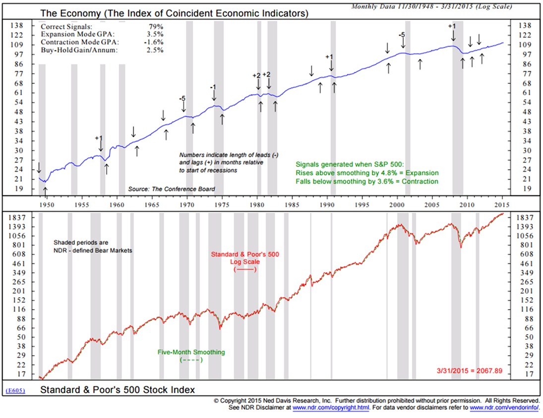
Here is a short summary of how to read the chart (source: NDR):
The chart compares the economy, as represented by the Commerce Department’s Composite Index of Coincident Indicators (top clip), with the monthly closing price of the Standard and Poor’s 500 Stock Index (bottom clip).
The S&P 500 is a capitalization-weighted (price times number of shares outstanding) index of 500 of the largest and best known common stocks. These include industrials, transports, utilities, and financials.
The S&P 500 generates an expansion signal for the economy when it rises above its eight-month smoothing by 2.0%. Conversely, it generates a contraction signal for the economy when it falls below its eight-month smoothing by 4.6%.
Because the stock market is a barometer of investor confidence in future business activity (as well as a source of capital for industry), it tends to be an excellent leading economic indicator. An NDR research study has found that from 1948 to 1991, the S&P 500 has led, on average, economic peaks by eight months and economic troughs by four months.
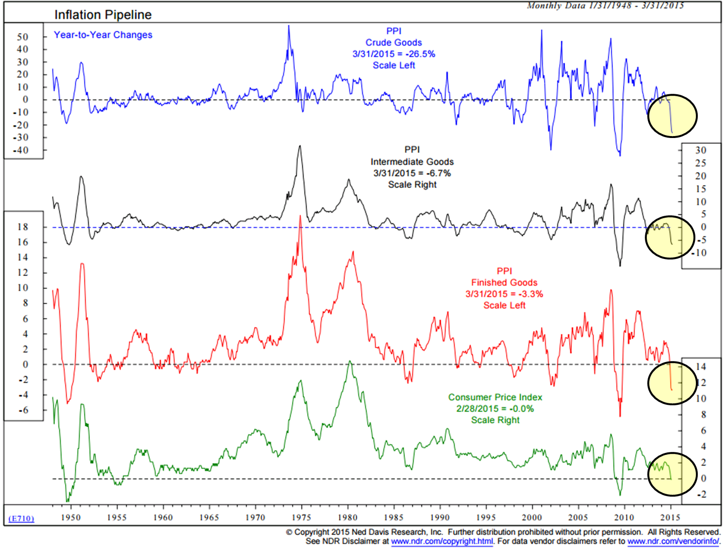
Given the Fed’s dual mandate to increase inflation and employment, let’s take a look at current inflation and the velocity of money in the next two charts. In short, inflation is not a problem currently and the velocity of money is at a record low.
Inflation is Not Currently a Problem
I circle in yellow the most recent year-over-year changes in PPI and CPI. There is clearly no sign of inflation.
Velocity of Money
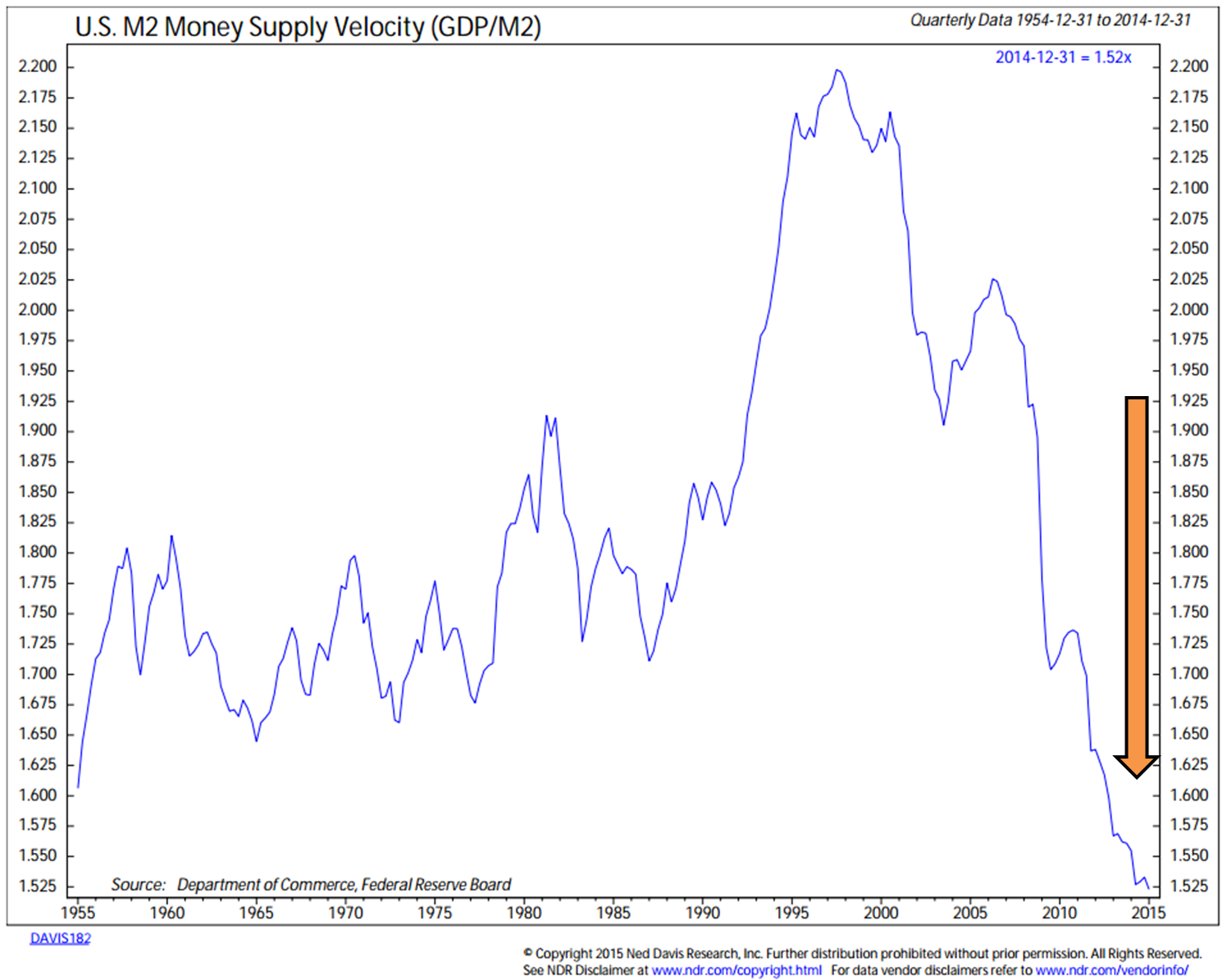
This chart plots money supply velocity for the U.S., calculated as gross domestic product divided by M2 money supply and shows secular trends in velocity since 1954.
“The velocity of money refers to how fast money passes from one holder to the next. If the velocity of money is increasing, then transactions are occurring between individuals more frequently.” Source:Wikipedia.
continue reading: http://www.cmgwealth.com/ri/on-my-radar-recession-watch-keep-an-eye-on-this-chart/