
“We fail to comprehend how owners of claims on money (that is, bondholders) can continue to ignore the fact that the goal of generating more inflation is aimed precisely at reducing the value of their capital. The opportunity, then, is to short bonds.”
– Paul Singer (Trades, Portfolio)
Do you remember that feeling you had when you were a kid as you walked out of school and opened the door to summer? Yesterday, Susan’s oldest graduated from high school. I loved the closing commencement remarks, “now go forward and shine your light bright.” Caps in the air. What a feeling!
Man, I wish I could have that feeling again. Though it is nice to see it on the faces of our children. But alas, a family to raise, bills to pay, and inflation and bond yields on my mind. So back to work we go and fortunate that this is a fun business.
It’s been a wild week for bonds. The 10-year has gone from 1.92% to 2.40% since early April. A loss of 4.24%. Over the same period, the 30-year has gone from 2.62% to 3.11%. A loss of 9.51%. (Source: StockCharts.com)
I’m on record saying that the greatest bubble of all time is in the bond market. I believe that is where the greatest risks to your portfolio exist. Are we seeing warning shots across the bow? I think so.
So today, let’s take a look at the current state of inflation and the direction of interest rates and peek at a few processes that may help us better navigate the rough waters ahead. My gut says it will be the bond market that jerks the Fed’s chain. We’ll see. I do agree with Singer, “The Great (Greatest) Short” is in the bond market.
Included in this week’s On My Radar:
- Inflation and Interest Rates – Signs Point to Mild Disinflation (What I’m Watching)
- A Few Ideas on Managing Interest Rate Risk
- Investors Spent 75% of The Time Recovering From Loss (1900 to present)
- Trade Signals – Bond Yields a Mess, Equity Trend Positive, Sentiment Neutral
Inflation and Interest Rates – Signs Point to Mild Disinflation (What I’m Watching)
I sent a note to Ned Davis a few weeks ago asking him what indicators he looks at for inflation.
Ned replied with the following:
“This is a hard one for me. I think the most important indicator for the inflation super-cycle is the debt super-cycle, but it is very complicated. For something more current, I would look at our Inflation Timing Model. Other individual charts with great records I have found useful are E960A, E708A, E0720, E764 and DAVIS191. Obviously, looking at those charts suggests I think wage inflation is very important.”
Some chart code to dissect in that email so I’ll try to make some sense for you (and me).
First of all, what I like about NDR is their data approach to investment research. This business is confusing enough and often what many believe will happen is completely the opposite of what actually does happen. So into the data we dig.
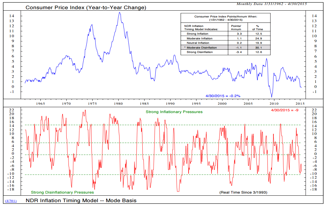
This first chart is NDR’s “Inflation Timing Model.” It shows that with overall inflationary pressures at -9, we are in a period of “moderate disinflation”. (Bottom section reading as of 4-30-15 is -9) Note the -1.1% decline in the CPI per annum when in the moderate disinflation zone.
Next are two charts that show inflation to be low:
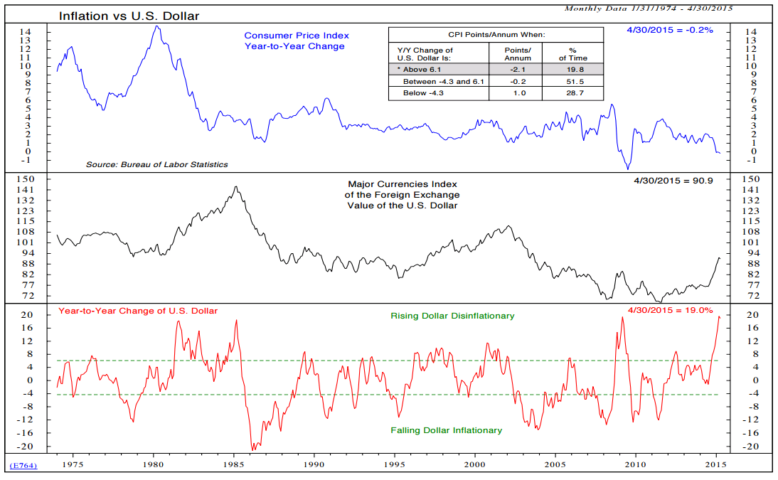
1) Inflation vs. U.S. Dollar:
Note in the bottom section of the next chart how disinflationary a rising dollar historically tends to be (bottom clip with stats on the current state shaded in the upper clip).
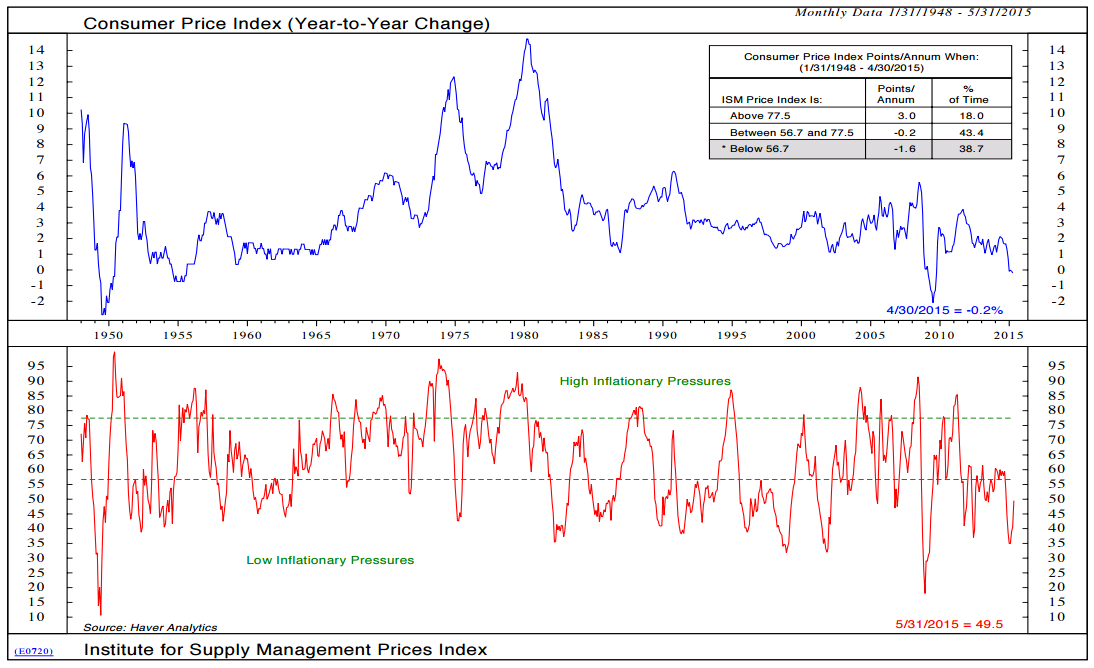
 2) Consumer Price Index (Year-to-Year Change).
Here, too, we see low inflationary pressure today.
However, there are some signs that core CPI inflation is turning. Ned noted that, over the last four months, year-over-year core CPI inflation has gone from 1.65% (January 2014 to January 2015), 1.70% (February to February), 1.75% (March to March), and the latest reading was 1.81% in (April to April).
Service inflation is running at 2.3%, shelter inflation is running 3% and CPI for medical care is 2.9%. As Ned shares, “Shelter and medical care are, of course, big deals.”
So which is it? Deflation, disinflation or inflation. It still looks like disinflation with signs of inflation on the horizon. Wages are important and with a high .85 correlation to Core PCE, you can see a big uptick since late 2014 below (dotted red line). Note how closely the blue line (Personal Consumption Expenditures) follows the dotted red line. Kind of a good news (wages are going up), bad news thing (inflation).
continue reading: http://www.cmgwealth.com/ri/on-my-radar-shine-your-light-bright/