
Positioning statements and introductory remarks: learning from the past
The following presentation, through the lens of our F.A.S.T. Graphs™ research tool, reveals a picture of each company's past present and future fundamental values. We're often asked, and even criticized, for placing too much emphasis on historical information and values. Therefore, we offer the following positioning statements in our defense.
First of all, before we would ever invest in a company we feel it is only logical to have a perspective on how well the business has been managed. Therefore, a review of the company's operating history speaks volumes about the company's business and the success it has achieved on behalf of shareholders.
Success leaves clues, and since the nature of a business does not change drastically overnight, a perspective of its historical earnings growth speaks volumes. Armed with this knowledge, we believe we are better qualified regarding making sounder and more intelligent decisions on what the future may bring. Consequently, we believe that our F.A.S.T. Graphs™, "fundamentals at a glance" research tool elegantly provides us this perspective.
In other words, by reviewing the company's past operating success we can almost instantly determine whether the company's business is cyclical or consistent, and determine how fast the company has been capable of growing in the past. Moreover, when we overlay stock prices and correlate them to the company's past operating success, we can also determine how the market has traditionally treated each company's fundamentals. All of this information, we believe, can prove vital in making intelligent long-term investment decisions on any respective company examined.
However, this is not all we can learn from the past. There are also many general investment lessons and principles that can be gleaned from a review of history. One of the more obvious lessons to learn and observe, is the importance of valuation in conjunction with how a company's intrinsic value will inevitably be reflected by the market. By looking at price correlated to fundamentals, we can quickly determine that the notion of an always efficient market does not hold up in the real world. On the other hand, the idea that the market will always be seeking efficiency tends to pass the test of time.
There is no other class of equities that teaches the above investing lessons more vividly and profoundly than do technology stocks. The now infamous, irrational exuberant period, which started in the mid-90s and abruptly ended in the spring of calendar year 2000, is vividly depicted by reviewing the price correlated to fundamentals relationship of tech stocks over that timeframe. Each of these five examples reviewed in this article will not only show how inefficient the market was over that time frame, but will simultaneously illustrate the devastating effects of a bubble, or in our view, an overheated and overvalued stock price.
Furthermore, a review of history also reveals that in the long run, earnings determine market values, and dividend income. This simply validates the principle and common sense idea that a business, or any investment for that matter, ultimately derives its value from the amount of cash flows (earnings) that it is capable of generating for its owners. More simply stated, the better the business is capable of performing on an operating basis, the stronger the returns that shareholders can expect to receive over time. Of course this assumes that the investor also observes and obeys sound principles of valuation. Pay too much for even the best company, and future returns will be far less than warranted.
Investing is Always About the Future
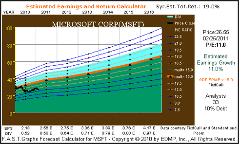
Additionally, it's important to acknowledge that even though there's a lot that can be learned from the past, as investors we can only purchase the future. Therefore, all pending or future investment decisions need to be based on a rational forecast and perspective of what each respective company is capable of achieving going forward. We believe a good starting point is to look at what the leading analysts are expecting, regarding the future earnings potential of any company in question. The estimated earnings and return calculator was created to do that task. This tool simply calculates future earnings based on consensus estimates, and then runs those numbers out to their logical conclusion.
The reader should keep in mind that much of what the analysts are providing has come directly from guidance supplied by each company's management. As a general rule, most reputable management teams endeavor to be conservative with their guidance. Prudent management understands that it's always better for their stock values if they exceed guidance, than it is to fall short of expectations. On the live F.A.S.T. Graphs™ research tool the user can override consensus estimates and input any number they feel is more relevant.
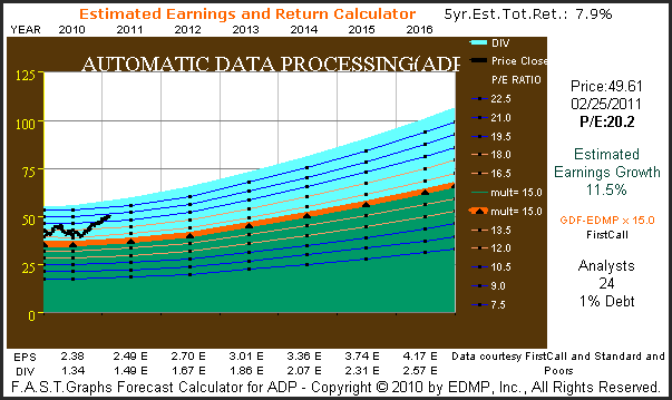
A Simple Guide to Interpreting the F.A.S.T. Graphs™
Three graphs will be provided on each of the following five technology titans. First, we will provide a 20 year historical graph that correlates monthly closing stock prices to earnings growth. Note that each 20 year graph contains 19 years of history and includes one year of forecast (currently year 2011). Calendar year high and low stock prices for each year are listed at the top of each graph. Below each graph you will see earnings per share, the change per share and dividends listed. Also, due to space constraints, data is only listed for every other year (omitted years are marked with an *), however, all 19+ years of data points are plotted on each graph.
The black line on each graph plots monthly closing stock prices. The orange line plots each year's earnings growth multiplied by widely recognized formulas for valuing a business. The appropriate price earnings ratio is marked to the right of each graph, and color-coded in orange letters. The green shaded area represents earnings, and the light blue shaded area represents dividends that are paid out of earnings. Dividends are separated and stacked on top merely for visual perspective, but note that they represent the portion of the green shaded area (earnings) paid as dividends.
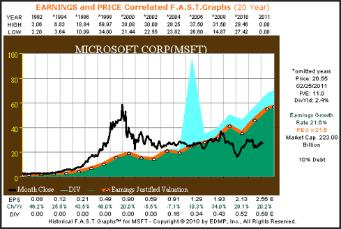
Microsoft (MSFT, Financial)
"Founded in 1975, Microsoft is the worldwide leader in software, services and solutions that help people and businesses realize their full potential."
From the earnings and price correlated graphs on Microsoft (MSFT) since 1992 we see that the company has grown earnings in excess of 21% per annum. Although there have been minor bouts of cyclicality with their earnings growth, all in all, Microsoft's growth has been very consistent. There are two very interesting takeaways that the Microsoft graph reveals. The first deals with their stock price, and the second relates to their dividends.
From the graph it is clear that Microsoft's purest earnings growth phase ended in the summer of calendar year 2000. Regarding the stock price, from 1995 to the spring of calendar year 2000, Microsoft, like most tech stocks, saw their stock price reach stratospheric portions. However, the recession of 2001 brought Microsoft's lofty valuations to an abrupt end. With earnings faltering for the first time in the company's history, the company's stock price began falling, and continued their descent for almost 6 years. You'll notice a very similar pattern with the four remaining tech stocks we review in this article.
We can also see from the bottom of the graph that earnings growth since calendar year 2000, although still above average, was much lower than it had historically been. Therefore, with growth slowing Microsoft's need for capital also waned, and the company instituted their first dividend in calendar year 2003 (the light blue shaded area). Note that after building up huge cash reserves as a result of their significant earnings growth rates, Microsoft (MSFT) paid a special three dollar per share dividend in 2004. This explains the huge spike in the light blue shaded area on the graph. Currently, Microsoft offers a starting dividend yield of approximately 2.4%.
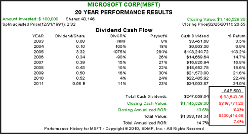
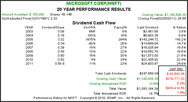
The calculated performance results associated with the above graph shows that Microsoft (MSFT) has significantly outperformed the S&P 500 since 1992. Importantly, the dividend cash flow table shows that Microsoft's dividends have consistently grown at a high rate since they were first paid in 2003. Keep in mind, the three dollars special dividend they paid in December of 2004 gives the illusion that the dividend was cut the following year. In truth, their normal dividend has increased each year since they started paying one. Finally, notice that their payout ratio still leaves room for an expansion of their dividend policy in the future.
The consensus of 33 analysts reporting to FirstCall estimates that Microsoft (MSFT) will grow earnings at 11% per annum over the next five years. Consequently, this high-quality software giant appears to be undervalued with a current PE ratio of only 11.
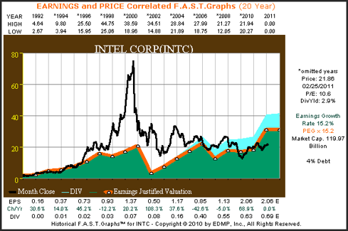
Intel Corp. (INTC, Financial)
"Intel is a world leader in computing innovation. The company designs and builds the essential technologies that serve as the foundation for the world's computing devices."
Intel Corp. (INTC) has grown earnings in excess of 15% per annum since 1992. As we saw first with Microsoft, the graphs on each of these five tech titans reveals a common pattern of price action during the famous technology bubble, commonly referred to as the irrational exuberant period. Stock prices become extremely overvalued based on investors feeding frenzy for all things tech, and then the sobering effects of the 2001 recession bring it all to an abrupt end.
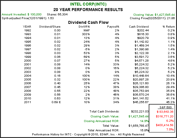
Intel (INTC) currently offers investors a starting dividend yield of approximately 3%. Although the company has paid dividends since 1993, their payout ratio was so low as to not even be visible on the graph. Similar to Microsoft, Intel's first meaningful dividend started in calendar year 2004.
From the calculated performance associated with the graph above, we see that Intel (INTC) has rewarded shareholders at approximately the same rate of return as their earnings growth achievement. However, we also saw from the graph above that the road to getting there was very treacherous at times. Intel's rate of change of dividend growth and the evolution of their payout percentage (payout ratio) is of special interest to investors seeking a competitive current dividend yield with the potential for growth.
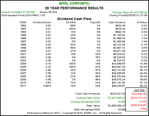 The consensus of 42 analysts reporting to FirstCall, estimate that Intel (INTC) will grow earnings at 10% per annum over the next five years. Therefore, with a current PE ratio of approximately 10.6, and with only 4% debt on their balance sheet, Intel Corp. appears very attractively valued at these levels. Investors seeking a competitive and growing yield with the opportunity for capital gains might want to consider this blue-chip technology titan.

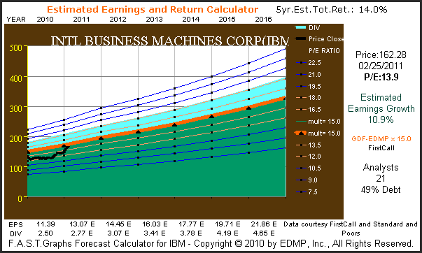
International Business Machines Corp. (IBM, Financial)
"IBM is a worldwide manufacturer and seller of computers, hardware and software ranging from mainframe computers to nanotechnology. They also offer advanced information processing technology, communication systems, hosting and consulting services."
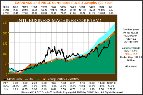
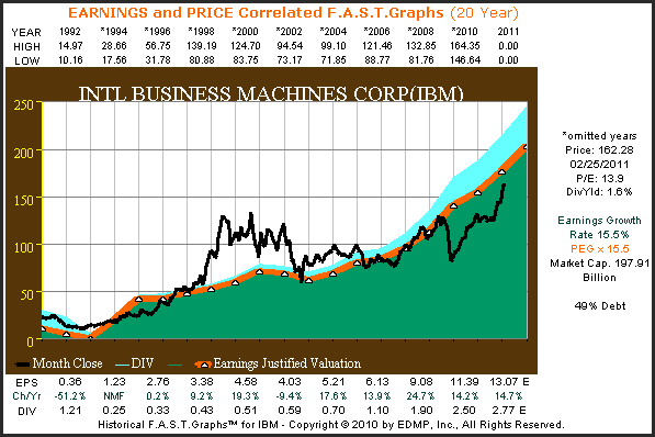
When you review the long-term operating record of IBM since 1992, you have to be impressed with how consistent and fast this over $200 billion market cap behemoth has grown their operating earnings. However, it always hasn't been this way for IBM. From the mid-80s to the early 90s IBM went through a period where their earnings growth was very inconsistent and cyclical. On the graph below you can see a glimpse of this by looking at earnings for 1992 and 1993. More recently, IBM has been able to put together a string of very consistent earnings growth which they were even able to maintain through the great recession of 2008.
But, just like the two examples in this article that preceded IBM, their stock price also became highly overvalued during the irrational exuberant period which ended in calendar year 2000. Since IBM's stock price reverted to the mean in September of calendar year 2002, their stock price has more closely tracked earnings. Even though IBM's earnings growth was strong in calendar year 2008 their stock price did drop precipitously along with most tech stocks, however, as earnings have continued to grow, IBM's stock price has recovered. IBM currently offers a dividend yield of 1.6%.
From the calculated performance results associated with the above graph, we discover that IBM has generated above-average returns for shareholders since 1992. However, like the other technology stocks covered in this article, the path to achieving these returns was clearly not a straight line.
Although IBM has paid a dividend every year since 1992, it has only been a consistent dividend payer since the mid-1990s. Over the years IBM's payout ratio has increased to currently over 21%, which still leaves room for a higher payout in the future.
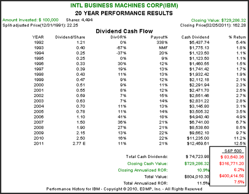
The consensus of 21 analysts reporting to FirstCall, estimate that IBM will grow earnings by approximately 11% per annum over the next five years. Therefore, with a current price earnings ratio of just under 14, IBM appears to be fairly valued at these levels.

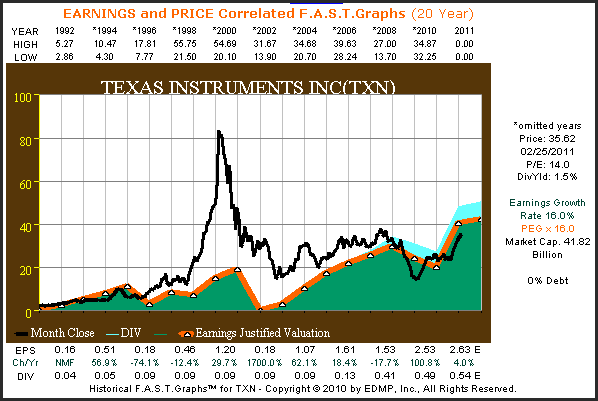
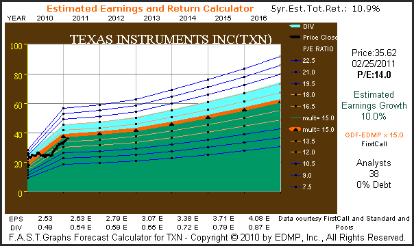
Texas Instruments (TXN, Financial)
"Texas Instruments helps customers solve problems and develop new electronics that make the world smarter, healthier, safer, greener and more fun. A global semiconductor company, TI innovates through design, sales and manufacturing operations in more than 30 countries."
Texas Instruments (TXN) has grown earnings at a compounded rate of 16% per annum since 1992. However, a quick review of the graph below shows that there were several periods of cyclicality found throughout their operating history. Once again, we see a massive overvaluation in their stock price in 1999, followed by a swift and precipitous dropped to more earnings justified levels. Texas Instruments currently offers a dividend yield of 1.5%.
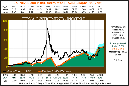
From the calculated performance results associated with the above graph we discover that Texas Instruments (TXN) has rewarded shareholders in almost direct proportion to their earnings growth. Although the company has paid a dividend since calendar year 1992, it has only been since calendar year 2007 where the dividend has become meaningful. Since that time, the company has increased their dividend at a very attractive growth rate.
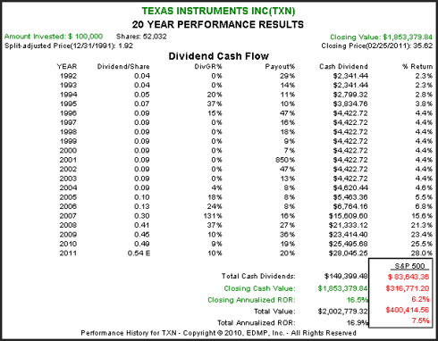
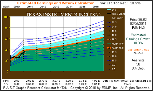
The consensus of 38 analysts reporting to FirstCall estimate that Texas Instruments (TXN) will grow earnings at 10% per annum over the next five years. Since Texas Instruments currently trades at a PE ratio of 14, this high-quality technology stalwart appears to be reasonably priced. The company's dividend is well protected by strong cash flow generation, and they have no debt on their balance sheet.
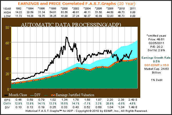
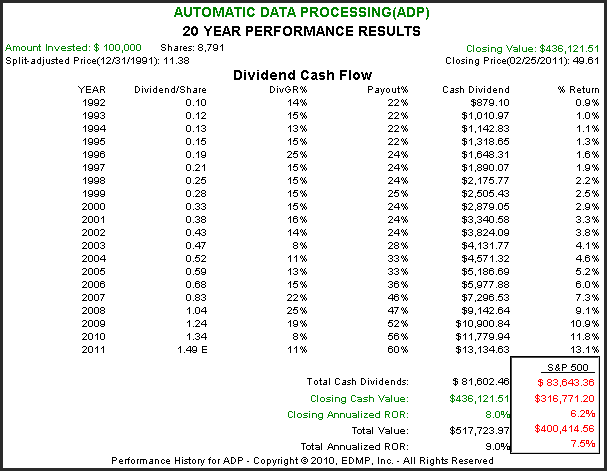
Automatic Data Processing (ADP, Financial)
"ADP, with nearly $9 billion in revenues and about 550,000 clients worldwide, is one of the largest providers of business outsourcing solutions."
Automatic Data Processing (ADP) has grown earnings at a compounded rate of 9.5% per annum since 1992. An interesting fact that is discovered when reviewing the earnings and price correlated graph below is how the market has consistently priced this blue-chip higher than their earnings justified levels would indicate. Automatic Data Processing currently offers a dividend yield of 2.9%. Automatic Data Processing does generate very strong operating cash flows and only has 1% debt on their balance sheet.
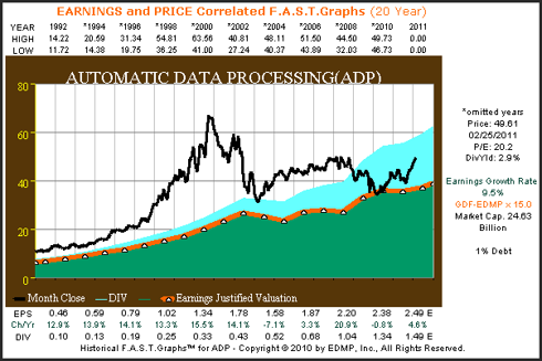
When reviewing the calculated performance results associated with the above graph, we discover that Automatic Data Processing (ADP) has rewarded shareholders moderately greater than average, as measured by the S&P 500. ADP has increased their dividend every year since 1992. However, as the dividend cash flow table depicts, their payout ratio has also been steadily increasing since calendar year 2004. We believe this indicates that ADP is committed to a strong dividend policy in order to reward their shareholders.

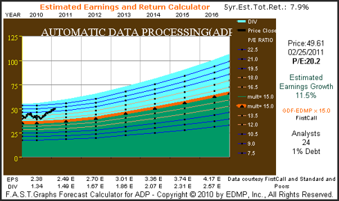
The consensus of 24 analysts reporting to FirstCall, estimate that ADP will grow earnings by 11 1/2% per annum over the next five years. Of the five companies covered in this article, ADP is expected to grow the fastest. However, investors should note that the current price earnings ratio of 20 is also the highest of the group. Furthermore, prospective investors might want to consider, as we've previously mentioned, how the market has traditionally priced this blue-chip in excess of their earnings justified levels. However, respective investors need to consider whether or not this valuation risk is worth taking -or not.
Summary and Conclusions
The Five Technology Titans covered in this article are among the most widely recognized technology companies in the world. Traditionally, these companies would have been looked at as high growth, and perhaps, high risk technology stocks. However, much has changed with the technology industry over the last decade. After reaching critical mass in the early 1990s, technology has become a ubiquitous part of the world's culture. Consequently, it should be no surprise that technology stocks may have become the blue-chip stalwarts of the modern age.
It wasn't too long ago when the mention of the words "blue chip" or "stalwart" conjured up images of toothpaste or toilet paper. Today, we speak just as commonly about personal computers, smartphones, the Internet and the cloud, etc. Although it may seem strange at first to consider Microsoft, Intel, IBM, Texas Instruments and ADP as blue-chip income producing stocks, that time appears to have come. Therefore, we suggest that investors looking for high-quality dividend paying companies might want to consider today's evolved breed of dividend paying technology stocks.
These five specific examples were selected for a couple of very important reasons. First of all, they are all large-cap industry leading technology companies with moderate to above-average dividend yields. Next, they are all companies with strong balance sheets that are, by consensus, expected to continue to grow earnings at double-digit rates over the next five years. Finally, they all appear to be reasonably valued at current levels. Only IBM and ADP currently possess price earnings ratios which are higher than their expected earnings growth rates.
Therefore, these technology titans appear to be an attractive opportunity to diversify the investment portfolios of investors seeking growth and growth of income. Although this review has provided a significant amount of essential fundamentals at a glance, it is only offered as a starting point for a more comprehensive due diligence effort.
The opinions in this document are for informational and educational purposes only and should not be construed as a recommendation to buy or sell the stocks mentioned or to solicit transactions or clients. Past performance of the companies discussed may not continue and the companies may not achieve the earnings growth as predicted. The information in this document is believed to be accurate, but under no circumstances should a person act upon the information contained within. We do not recommend that anyone act upon any investment information without first consulting an investment advisor as to the suitability of such investments for his specific situation.
The following presentation, through the lens of our F.A.S.T. Graphs™ research tool, reveals a picture of each company's past present and future fundamental values. We're often asked, and even criticized, for placing too much emphasis on historical information and values. Therefore, we offer the following positioning statements in our defense.
First of all, before we would ever invest in a company we feel it is only logical to have a perspective on how well the business has been managed. Therefore, a review of the company's operating history speaks volumes about the company's business and the success it has achieved on behalf of shareholders.
Success leaves clues, and since the nature of a business does not change drastically overnight, a perspective of its historical earnings growth speaks volumes. Armed with this knowledge, we believe we are better qualified regarding making sounder and more intelligent decisions on what the future may bring. Consequently, we believe that our F.A.S.T. Graphs™, "fundamentals at a glance" research tool elegantly provides us this perspective.
In other words, by reviewing the company's past operating success we can almost instantly determine whether the company's business is cyclical or consistent, and determine how fast the company has been capable of growing in the past. Moreover, when we overlay stock prices and correlate them to the company's past operating success, we can also determine how the market has traditionally treated each company's fundamentals. All of this information, we believe, can prove vital in making intelligent long-term investment decisions on any respective company examined.
However, this is not all we can learn from the past. There are also many general investment lessons and principles that can be gleaned from a review of history. One of the more obvious lessons to learn and observe, is the importance of valuation in conjunction with how a company's intrinsic value will inevitably be reflected by the market. By looking at price correlated to fundamentals, we can quickly determine that the notion of an always efficient market does not hold up in the real world. On the other hand, the idea that the market will always be seeking efficiency tends to pass the test of time.
There is no other class of equities that teaches the above investing lessons more vividly and profoundly than do technology stocks. The now infamous, irrational exuberant period, which started in the mid-90s and abruptly ended in the spring of calendar year 2000, is vividly depicted by reviewing the price correlated to fundamentals relationship of tech stocks over that timeframe. Each of these five examples reviewed in this article will not only show how inefficient the market was over that time frame, but will simultaneously illustrate the devastating effects of a bubble, or in our view, an overheated and overvalued stock price.
Furthermore, a review of history also reveals that in the long run, earnings determine market values, and dividend income. This simply validates the principle and common sense idea that a business, or any investment for that matter, ultimately derives its value from the amount of cash flows (earnings) that it is capable of generating for its owners. More simply stated, the better the business is capable of performing on an operating basis, the stronger the returns that shareholders can expect to receive over time. Of course this assumes that the investor also observes and obeys sound principles of valuation. Pay too much for even the best company, and future returns will be far less than warranted.
Investing is Always About the Future
Additionally, it's important to acknowledge that even though there's a lot that can be learned from the past, as investors we can only purchase the future. Therefore, all pending or future investment decisions need to be based on a rational forecast and perspective of what each respective company is capable of achieving going forward. We believe a good starting point is to look at what the leading analysts are expecting, regarding the future earnings potential of any company in question. The estimated earnings and return calculator was created to do that task. This tool simply calculates future earnings based on consensus estimates, and then runs those numbers out to their logical conclusion.
The reader should keep in mind that much of what the analysts are providing has come directly from guidance supplied by each company's management. As a general rule, most reputable management teams endeavor to be conservative with their guidance. Prudent management understands that it's always better for their stock values if they exceed guidance, than it is to fall short of expectations. On the live F.A.S.T. Graphs™ research tool the user can override consensus estimates and input any number they feel is more relevant.
A Simple Guide to Interpreting the F.A.S.T. Graphs™
Three graphs will be provided on each of the following five technology titans. First, we will provide a 20 year historical graph that correlates monthly closing stock prices to earnings growth. Note that each 20 year graph contains 19 years of history and includes one year of forecast (currently year 2011). Calendar year high and low stock prices for each year are listed at the top of each graph. Below each graph you will see earnings per share, the change per share and dividends listed. Also, due to space constraints, data is only listed for every other year (omitted years are marked with an *), however, all 19+ years of data points are plotted on each graph.
The black line on each graph plots monthly closing stock prices. The orange line plots each year's earnings growth multiplied by widely recognized formulas for valuing a business. The appropriate price earnings ratio is marked to the right of each graph, and color-coded in orange letters. The green shaded area represents earnings, and the light blue shaded area represents dividends that are paid out of earnings. Dividends are separated and stacked on top merely for visual perspective, but note that they represent the portion of the green shaded area (earnings) paid as dividends.
Microsoft (MSFT, Financial)
"Founded in 1975, Microsoft is the worldwide leader in software, services and solutions that help people and businesses realize their full potential."
From the earnings and price correlated graphs on Microsoft (MSFT) since 1992 we see that the company has grown earnings in excess of 21% per annum. Although there have been minor bouts of cyclicality with their earnings growth, all in all, Microsoft's growth has been very consistent. There are two very interesting takeaways that the Microsoft graph reveals. The first deals with their stock price, and the second relates to their dividends.
From the graph it is clear that Microsoft's purest earnings growth phase ended in the summer of calendar year 2000. Regarding the stock price, from 1995 to the spring of calendar year 2000, Microsoft, like most tech stocks, saw their stock price reach stratospheric portions. However, the recession of 2001 brought Microsoft's lofty valuations to an abrupt end. With earnings faltering for the first time in the company's history, the company's stock price began falling, and continued their descent for almost 6 years. You'll notice a very similar pattern with the four remaining tech stocks we review in this article.
We can also see from the bottom of the graph that earnings growth since calendar year 2000, although still above average, was much lower than it had historically been. Therefore, with growth slowing Microsoft's need for capital also waned, and the company instituted their first dividend in calendar year 2003 (the light blue shaded area). Note that after building up huge cash reserves as a result of their significant earnings growth rates, Microsoft (MSFT) paid a special three dollar per share dividend in 2004. This explains the huge spike in the light blue shaded area on the graph. Currently, Microsoft offers a starting dividend yield of approximately 2.4%.

The calculated performance results associated with the above graph shows that Microsoft (MSFT) has significantly outperformed the S&P 500 since 1992. Importantly, the dividend cash flow table shows that Microsoft's dividends have consistently grown at a high rate since they were first paid in 2003. Keep in mind, the three dollars special dividend they paid in December of 2004 gives the illusion that the dividend was cut the following year. In truth, their normal dividend has increased each year since they started paying one. Finally, notice that their payout ratio still leaves room for an expansion of their dividend policy in the future.
The consensus of 33 analysts reporting to FirstCall estimates that Microsoft (MSFT) will grow earnings at 11% per annum over the next five years. Consequently, this high-quality software giant appears to be undervalued with a current PE ratio of only 11.

Intel Corp. (INTC, Financial)
"Intel is a world leader in computing innovation. The company designs and builds the essential technologies that serve as the foundation for the world's computing devices."
Intel Corp. (INTC) has grown earnings in excess of 15% per annum since 1992. As we saw first with Microsoft, the graphs on each of these five tech titans reveals a common pattern of price action during the famous technology bubble, commonly referred to as the irrational exuberant period. Stock prices become extremely overvalued based on investors feeding frenzy for all things tech, and then the sobering effects of the 2001 recession bring it all to an abrupt end.
Intel (INTC) currently offers investors a starting dividend yield of approximately 3%. Although the company has paid dividends since 1993, their payout ratio was so low as to not even be visible on the graph. Similar to Microsoft, Intel's first meaningful dividend started in calendar year 2004.

From the calculated performance associated with the graph above, we see that Intel (INTC) has rewarded shareholders at approximately the same rate of return as their earnings growth achievement. However, we also saw from the graph above that the road to getting there was very treacherous at times. Intel's rate of change of dividend growth and the evolution of their payout percentage (payout ratio) is of special interest to investors seeking a competitive current dividend yield with the potential for growth.
 The consensus of 42 analysts reporting to FirstCall, estimate that Intel (INTC) will grow earnings at 10% per annum over the next five years. Therefore, with a current PE ratio of approximately 10.6, and with only 4% debt on their balance sheet, Intel Corp. appears very attractively valued at these levels. Investors seeking a competitive and growing yield with the opportunity for capital gains might want to consider this blue-chip technology titan.
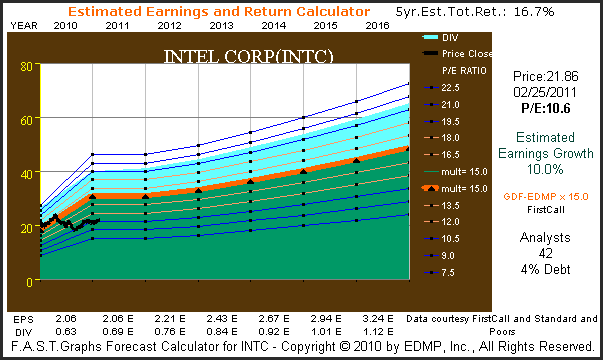
International Business Machines Corp. (IBM, Financial)
"IBM is a worldwide manufacturer and seller of computers, hardware and software ranging from mainframe computers to nanotechnology. They also offer advanced information processing technology, communication systems, hosting and consulting services."
When you review the long-term operating record of IBM since 1992, you have to be impressed with how consistent and fast this over $200 billion market cap behemoth has grown their operating earnings. However, it always hasn't been this way for IBM. From the mid-80s to the early 90s IBM went through a period where their earnings growth was very inconsistent and cyclical. On the graph below you can see a glimpse of this by looking at earnings for 1992 and 1993. More recently, IBM has been able to put together a string of very consistent earnings growth which they were even able to maintain through the great recession of 2008.
But, just like the two examples in this article that preceded IBM, their stock price also became highly overvalued during the irrational exuberant period which ended in calendar year 2000. Since IBM's stock price reverted to the mean in September of calendar year 2002, their stock price has more closely tracked earnings. Even though IBM's earnings growth was strong in calendar year 2008 their stock price did drop precipitously along with most tech stocks, however, as earnings have continued to grow, IBM's stock price has recovered. IBM currently offers a dividend yield of 1.6%.
From the calculated performance results associated with the above graph, we discover that IBM has generated above-average returns for shareholders since 1992. However, like the other technology stocks covered in this article, the path to achieving these returns was clearly not a straight line.
Although IBM has paid a dividend every year since 1992, it has only been a consistent dividend payer since the mid-1990s. Over the years IBM's payout ratio has increased to currently over 21%, which still leaves room for a higher payout in the future.

The consensus of 21 analysts reporting to FirstCall, estimate that IBM will grow earnings by approximately 11% per annum over the next five years. Therefore, with a current price earnings ratio of just under 14, IBM appears to be fairly valued at these levels.
Texas Instruments (TXN, Financial)
"Texas Instruments helps customers solve problems and develop new electronics that make the world smarter, healthier, safer, greener and more fun. A global semiconductor company, TI innovates through design, sales and manufacturing operations in more than 30 countries."
Texas Instruments (TXN) has grown earnings at a compounded rate of 16% per annum since 1992. However, a quick review of the graph below shows that there were several periods of cyclicality found throughout their operating history. Once again, we see a massive overvaluation in their stock price in 1999, followed by a swift and precipitous dropped to more earnings justified levels. Texas Instruments currently offers a dividend yield of 1.5%.
From the calculated performance results associated with the above graph we discover that Texas Instruments (TXN) has rewarded shareholders in almost direct proportion to their earnings growth. Although the company has paid a dividend since calendar year 1992, it has only been since calendar year 2007 where the dividend has become meaningful. Since that time, the company has increased their dividend at a very attractive growth rate.

The consensus of 38 analysts reporting to FirstCall estimate that Texas Instruments (TXN) will grow earnings at 10% per annum over the next five years. Since Texas Instruments currently trades at a PE ratio of 14, this high-quality technology stalwart appears to be reasonably priced. The company's dividend is well protected by strong cash flow generation, and they have no debt on their balance sheet.
Automatic Data Processing (ADP, Financial)
"ADP, with nearly $9 billion in revenues and about 550,000 clients worldwide, is one of the largest providers of business outsourcing solutions."
Automatic Data Processing (ADP) has grown earnings at a compounded rate of 9.5% per annum since 1992. An interesting fact that is discovered when reviewing the earnings and price correlated graph below is how the market has consistently priced this blue-chip higher than their earnings justified levels would indicate. Automatic Data Processing currently offers a dividend yield of 2.9%. Automatic Data Processing does generate very strong operating cash flows and only has 1% debt on their balance sheet.
When reviewing the calculated performance results associated with the above graph, we discover that Automatic Data Processing (ADP) has rewarded shareholders moderately greater than average, as measured by the S&P 500. ADP has increased their dividend every year since 1992. However, as the dividend cash flow table depicts, their payout ratio has also been steadily increasing since calendar year 2004. We believe this indicates that ADP is committed to a strong dividend policy in order to reward their shareholders.
The consensus of 24 analysts reporting to FirstCall, estimate that ADP will grow earnings by 11 1/2% per annum over the next five years. Of the five companies covered in this article, ADP is expected to grow the fastest. However, investors should note that the current price earnings ratio of 20 is also the highest of the group. Furthermore, prospective investors might want to consider, as we've previously mentioned, how the market has traditionally priced this blue-chip in excess of their earnings justified levels. However, respective investors need to consider whether or not this valuation risk is worth taking -or not.
Summary and Conclusions
The Five Technology Titans covered in this article are among the most widely recognized technology companies in the world. Traditionally, these companies would have been looked at as high growth, and perhaps, high risk technology stocks. However, much has changed with the technology industry over the last decade. After reaching critical mass in the early 1990s, technology has become a ubiquitous part of the world's culture. Consequently, it should be no surprise that technology stocks may have become the blue-chip stalwarts of the modern age.
It wasn't too long ago when the mention of the words "blue chip" or "stalwart" conjured up images of toothpaste or toilet paper. Today, we speak just as commonly about personal computers, smartphones, the Internet and the cloud, etc. Although it may seem strange at first to consider Microsoft, Intel, IBM, Texas Instruments and ADP as blue-chip income producing stocks, that time appears to have come. Therefore, we suggest that investors looking for high-quality dividend paying companies might want to consider today's evolved breed of dividend paying technology stocks.
These five specific examples were selected for a couple of very important reasons. First of all, they are all large-cap industry leading technology companies with moderate to above-average dividend yields. Next, they are all companies with strong balance sheets that are, by consensus, expected to continue to grow earnings at double-digit rates over the next five years. Finally, they all appear to be reasonably valued at current levels. Only IBM and ADP currently possess price earnings ratios which are higher than their expected earnings growth rates.
Therefore, these technology titans appear to be an attractive opportunity to diversify the investment portfolios of investors seeking growth and growth of income. Although this review has provided a significant amount of essential fundamentals at a glance, it is only offered as a starting point for a more comprehensive due diligence effort.
The opinions in this document are for informational and educational purposes only and should not be construed as a recommendation to buy or sell the stocks mentioned or to solicit transactions or clients. Past performance of the companies discussed may not continue and the companies may not achieve the earnings growth as predicted. The information in this document is believed to be accurate, but under no circumstances should a person act upon the information contained within. We do not recommend that anyone act upon any investment information without first consulting an investment advisor as to the suitability of such investments for his specific situation.