
I started this monthly market valuation series in December 2009. The motivation for the article was that I was getting tired of hearing that the market was overvalued because P/E TTM was 87. This was ridiculous because earnings were deflated by the worst economic crash since the great depression. However, the question was how to value the market from a purely quantitative methodology, while ignoring all the outside noise and macro predictions of where the economy is headed. I looked for several different metrics to evaluate the market which over time have proven to be effective and decided to look at all the metrics, instead of just focusing on the last 12 months of earnings.
I was contemplating only updating the valuations on a quarterly basis, since why is there a need every month? However, since the market was and in general continues to be quite volatile, I consider it useful to evaluate on a monthly basis. When volatility truly gets to lower levels, it will suffice to update these series on a quarterly basis.
What a difference a month makes. In my market valuation article on June 2, 2011 I stated:
I find the current valuations astonishing. No, I am not referring to LinkedIn (LNKD, Financial) or Groupon or the high fliers. The overall market is so overvalued considering the macro picture. I am not a macro investor, but Wall Street is. It makes no sense for the Shiller PE to be at 23 (an earnings yield of 4.3%), when the deficit is out of control, there is inflation across the board except Real estate (the one asset class QE2 was really supposed to help!), housing is in a double dip, unemployment cannot come down for years unless there is job growth of 500k a month (close to impossible). Additionally, the euro zone is experiencing a big crisis, Japan suffered a catastrophic humanitarian and economic disaster, and countries like China are starting to get nervous about over heating in their economies.
What further demonstrates the inefficiencies in the market, is the valuation of small caps to large caps. The perma-bulls are looking for companies that have large exposure overseas, especially in emerging markets. However, the large cap companies produce far more of their revenue from overseas than small caps. Yet, large caps are far cheaper than small caps. This really defies logic.
The market declined 5.5% over the past month. Since July 16, the S&P500 has decreased over 16%. I was not predicting that the market would crash, merely stating that the market would eventually go down to more normalized levels. However, as the data below demonstrates, the market still seems overvalued by some metrics.
The current level of the S&P500 is 1,131, and the Dow is at 10,913 — lower than last month.
I update market valuations on a monthly basis. The point of this article is to measure the stock market based on seven different metrics. This article does not look at the macro picture and try to predict where the economy is headed.
I collaborate with two colleagues of mine for some of the data in this article, Doug Short of Dshort, and Josh of Multipl. All are great sites, and I encourage readers to check them out.
As always, I must mention that just because the market is over or undervalued does not mean that future returns will be high or low. From the mid to late 1990s the market was extremely overvalued and equities kept increasing year after year. In addition, individual stocks can be found that will outperform or underperform the market regardless of current valuations. However, as I note at the end of the article I expect low returns for the overall market, over the next 10 years based on current valuations when the metrics revert towards their mean.
To see my previous market valuation article from last month click here
Below are different market valuation metrics as of Oct. 1, 2011:
The current P/E TTM is 13.3, which is a large decrease than the TTM P/E of 15.6 from last month.
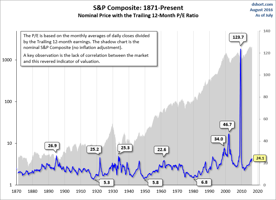
This data comes from my colleague Doug Short of dshort.com.
Based on this data the market is fairly valued. However, I do not think this is a fair way of valuing the market since it does not account for cyclical peaks or downturns. To get an accurate picture of whether the market is fair valued based on P/E ratio it is more accurate to take several years of earnings.
Numbers from Previous Market Lows:


The current ten-year P/E is 19.45; this is lower than the PE of 21.04 from the previous month. This number is based on Robert Shiller’s data evaluating the average inflation-adjusted earnings from the previous 10 years.
The Shiller PE is calculated using the four steps below:
The http://AAII put together the best criticism of the Shiller PE, which I have seen to date.
Below are the main points:
The criticisms are fair, and I do believe Shiller takes a more cautious approach to market valuations (Shiller can be described as a bit too cautious and overshoots on valuations). While Shiller’s method is by no means perfect, I think it is still a valid and the best method of market valuation for the following reasons.
Below is some further data showing how accurate the Shiller PE has been in predicting future market returns. First how has Shiller PE been in terms of predicting future returns in the past:


In conclusion to the argument about using CAPE, I would say that the Shiller PE despite slight flaws is a great metric for predicting future long term returns of the market.
Robert Shiller stated in an interview recently that he believes the S&P500 will be at 1430 in 2020. Shiller believes that based on his metric the market is overvalued, and will offer subpar returns over the next 10 years. However Shiller noted in another recent interview that the market is not too overvalued, as it has been over the past year. He also noted the ultra low interest rates, which make equities much more attractive. Shiller expects real returns of several percent a year, although below the 7% real return, which the market has historically returned.
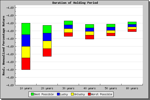
Based on Rob Bennett’s market return calculator, the return of the market should be 3.31% annually over the next ten years under the mostly likely scenario.
Rob states:
This new calculator tells you what return you can reasonably expect at various time-periods from an investment in the S&P stock index, presuming that stocks perform in the future much as they have in the past. The results are expressed in terms of real, annualized total (that is, with dividends reinvested and without additions or subtractions to principal) returns.
Mean: 16.41
Median: 15.80
Min: 4.78 (Dec 1920)
Max: 44.20 (Dec 1999)
Numbers from Previous Market lows:
Mar 2009 13.32
Mar 2003 21.32
Oct 1990 14.82
Nov1987 13.59
Aug 1982 6.64
Oct 1974 8.29
Oct 1966 18.83
Oct 1957 14.15
June 1949 9.07
April 1942 8.54
Mar 1938 12.38
Feb 1933 7.83
July 1932 5.84
Aug 1921 5.16
Dec 1917 6.41
Oct 1914 10.61
Nov 1907 10.59
Nov 1903 16.04
My colleague Doug Short thinks the Shiller’s numbers are a bit inaccurate because the number used above does not include the past several months of earnings, nor revisions. Doug calculates P/E 10 at 22.7.
Data and chart courtesy of [multpl.com]
Current P/BV 2.20

I thought the metric would be great for figuring out market returns because as Tweedy Browne and David Dreman demonstrate through extensive research, a basket of the lowest P/B stocks over long periods of time dramatically outperforms the market. It therefore would make sense that the P/B metric would be useful for evaluating the market itself in terms of over-valuation or undervaluation.
Horizon Asset management http://www.hamincny.com/docs/Horizon_Commentary_1stQuarter_2011.pdf used the same numbers for P/B provided by Standard and Poors and come up with a whopping 3.68% (for April), according to the same numbers that I used I came up with closer to 2.30%, and so did many other people include Barron’s. Since, the vast majority seem to conclude similar numbers to mine I will go with that figure over Horizon’s. The number that I used, I obtained using data from Barron’s, and updated using the latest change in the price of SPY. I am not sure where Horizon got their data from; no one else has measured book value at such a high rate.
Unfortunately, there is very little data regarding P/B. I have been able to find close to no historic data on the metric. Additionally, my number was always an outlier which made me suspect my numbers might be wrong. I even had a PHD student contact me to ask if there was any data available on price/book, I answered that I have not found any. If you are reading this or anyone else, and have the data I would be grateful if you sent it to me.
The average price over book value of the S&P over the past 30 years has been 2.41. Book value is considered a better measure of valuation than earnings by many investors including legendary investor Martin Whitman. He states that book value is harder to fudge than earnings (although book value can easily be distorted). In addition book value is less affected by economic cycles than one year earnings are. P/BV therefore provides a longer term accurate picture of a company’s value, than a TTM P/E. I will continue my search for P/B numbers.
Current Dividend Yield 2.15


The current dividend yield of the S&P is 2.15. This number is higher than 2.00 from last month. The number although below its average, is not so low considering compared to the 10-year Treasury currently is yielding an ultra low 1.92%. Recently as another flight to safety has occurred, Treasury yields have gone down, and the stock market has declined, pushing up the dividend yield.

For attractive yield check out my recent article about Australian debt-http://www.valuewalk.com/bonds/high-yield-low-risk-look-to-australia/.
It is hard to determine on this basis whether the market is overpriced. The dividend yield for stocks was much higher in the begging of this century than the later half. The dividend yield on the S&P fell below the yield on 10-Year treasuries for the first time in 1958, after the flight to safety when Lehman Brothers collapsed, it did so again recently, due to fears of another worldwide recession.
Many analysts in 1958 argued that the market was overpriced and the dividend yield should be higher than bond yields to compensate for stock market risk. For the next 50 years the dividend yield remained below the treasury yield and the market rallied significantly, until recently. In addition the dividend yield has been below 3% since the early 1990s. While I personally favor individual stocks with high dividend yields, the current tax code makes it far favorable for companies to retain earnings than to pay out dividends.
Finally, as I noted above the current economic environment has zero percent interest rates and low bond yields. During periods where yields are low it is logical for income oriented investors hungry for yield to be bid up the market, and dividend yields to decrease. I think it is hard to claim the market is overbought based on the low dividend yield.
Mean: 4.34%
Median: 4.28%
Min: 1.11% (Aug 2000)
Max: 13.84% (Jun 1932)
Numbers from Previous Market lows:
Mar 2009 3.60
Mar 2003 1.92
Oct 1990 3.88
Nov1987 3.58
Aug 1982 6.24
Oct 1974 5.17
Oct 1966 3.73
Oct 1957 4.29
Jun 1949 7.30
Apr 1942 8.67
Mar 1938 7.57
Feb 1933 7.84
July 1932 12.57
Aug 1921 7.44
Dec 1917 10.15
Oct 1914 5.60
Nov 1907 7.04
Nov 1903 5.57
Data and chart courtesy of [multpl.com]
Market cap to GDP is currently 78.5%, which is significantly lower than the 85.2% level from last month.
I was contemplating only updating the valuations on a quarterly basis, since why is there a need every month? However, since the market was and in general continues to be quite volatile, I consider it useful to evaluate on a monthly basis. When volatility truly gets to lower levels, it will suffice to update these series on a quarterly basis.
What a difference a month makes. In my market valuation article on June 2, 2011 I stated:
I find the current valuations astonishing. No, I am not referring to LinkedIn (LNKD, Financial) or Groupon or the high fliers. The overall market is so overvalued considering the macro picture. I am not a macro investor, but Wall Street is. It makes no sense for the Shiller PE to be at 23 (an earnings yield of 4.3%), when the deficit is out of control, there is inflation across the board except Real estate (the one asset class QE2 was really supposed to help!), housing is in a double dip, unemployment cannot come down for years unless there is job growth of 500k a month (close to impossible). Additionally, the euro zone is experiencing a big crisis, Japan suffered a catastrophic humanitarian and economic disaster, and countries like China are starting to get nervous about over heating in their economies.
What further demonstrates the inefficiencies in the market, is the valuation of small caps to large caps. The perma-bulls are looking for companies that have large exposure overseas, especially in emerging markets. However, the large cap companies produce far more of their revenue from overseas than small caps. Yet, large caps are far cheaper than small caps. This really defies logic.
The market declined 5.5% over the past month. Since July 16, the S&P500 has decreased over 16%. I was not predicting that the market would crash, merely stating that the market would eventually go down to more normalized levels. However, as the data below demonstrates, the market still seems overvalued by some metrics.
The current level of the S&P500 is 1,131, and the Dow is at 10,913 — lower than last month.
I update market valuations on a monthly basis. The point of this article is to measure the stock market based on seven different metrics. This article does not look at the macro picture and try to predict where the economy is headed.
I collaborate with two colleagues of mine for some of the data in this article, Doug Short of Dshort, and Josh of Multipl. All are great sites, and I encourage readers to check them out.
As always, I must mention that just because the market is over or undervalued does not mean that future returns will be high or low. From the mid to late 1990s the market was extremely overvalued and equities kept increasing year after year. In addition, individual stocks can be found that will outperform or underperform the market regardless of current valuations. However, as I note at the end of the article I expect low returns for the overall market, over the next 10 years based on current valuations when the metrics revert towards their mean.
To see my previous market valuation article from last month click here
Below are different market valuation metrics as of Oct. 1, 2011:
The current P/E TTM is 13.3, which is a large decrease than the TTM P/E of 15.6 from last month.
This data comes from my colleague Doug Short of dshort.com.
Based on this data the market is fairly valued. However, I do not think this is a fair way of valuing the market since it does not account for cyclical peaks or downturns. To get an accurate picture of whether the market is fair valued based on P/E ratio it is more accurate to take several years of earnings.
Numbers from Previous Market Lows:
The current ten-year P/E is 19.45; this is lower than the PE of 21.04 from the previous month. This number is based on Robert Shiller’s data evaluating the average inflation-adjusted earnings from the previous 10 years.
The Shiller PE is calculated using the four steps below:
- Look at the yearly earning of the S&P 500 for each of the past ten years.
- Adjust these earnings for inflation, using the CPI (ie: quote each earnings figure in 2011 dollars)
- Average these values (ie: add them up and divide by ten), giving us e10.
- Then take the current Price of the S&P 500 and divide by e10.
The http://AAII put together the best criticism of the Shiller PE, which I have seen to date.
Below are the main points:
- Following the Graham-Dodd recommendation, Shiller uses a 10-year moving average of earnings in computing the CAPE. According to data compiled by the National Bureau of Economic Research, economic contractions have become shorter and expansions longer in recent years. Measured peak to peak, the average is five years and six months.
- In determining the CAPE (Shiller PE), reported earnings are adjusted for inflation using the Consumer Price Index, where real values reflect current-period purchasing power. However Shiller uses data going back to 1871, when inflation was measured differently than today. There is an approximate 7% difference in the annual CPI inflation rate based on methodological changes over the last couple of decades.
- Tax codes have changed considerably since 1871. You can read further discussion of this issue above.
The criticisms are fair, and I do believe Shiller takes a more cautious approach to market valuations (Shiller can be described as a bit too cautious and overshoots on valuations). While Shiller’s method is by no means perfect, I think it is still a valid and the best method of market valuation for the following reasons.
- The 10-year Shiller PE shows markets overvalued by about 43% (at time of the article) and using a 6 year business cycle the market is still overvalued by 35% at time of writing. still shows it overvalued by about 35%. This is not a large difference to completely throw out Shiller’s methodology.
- Differences in inflation may effect the Shiller PE, but they would only have a small effect, especially if you decrease the earning duration. Also they should apply to any PE (TTM, six-year P/E, or forward P/E).
- Same point with accounting changes. Accounting changes would also effect P/B or ANY metric that is used to value the market, this is not limited to Shiller PE.
- Shiller PE has proved to be a good market valuation indicator. Shiller stated on February 22nd, 2009, that based on CAPE equities were cheap for the first time in decades. That was only two weeks before one of the biggest bull market rallies in history.
Below is some further data showing how accurate the Shiller PE has been in predicting future market returns. First how has Shiller PE been in terms of predicting future returns in the past:
In conclusion to the argument about using CAPE, I would say that the Shiller PE despite slight flaws is a great metric for predicting future long term returns of the market.
Robert Shiller stated in an interview recently that he believes the S&P500 will be at 1430 in 2020. Shiller believes that based on his metric the market is overvalued, and will offer subpar returns over the next 10 years. However Shiller noted in another recent interview that the market is not too overvalued, as it has been over the past year. He also noted the ultra low interest rates, which make equities much more attractive. Shiller expects real returns of several percent a year, although below the 7% real return, which the market has historically returned.
| Stock Market | Best Possible | Lucky | Most Likely | Unlucky | Worst Possible |
| 10-Year Percentage Returns | 9.31 | 6.31 | 3.31 | 0.31 | -2.69 |
| 20-Year Percentage Returns | 8.14 | 6.14 | 4.14 | 2.14 | 0.14 |
| 30-Year Percentage Returns | 8.60 | 7.60 | 6.60 | 5.60 | 4.60 |
| 40-Year Percentage Returns | 7.41 | 6.51 | 5.61 | 4.61 | 3.61 |
| 50-Year Percentage Returns | 7.40 | 6.60 | 5.80 | 5.10 | 4.40 |
| 60-Year Percentage Returns | 7.69 | 7.04 | 6.39 | 5.79 | 5.19 |
Rob states:
This new calculator tells you what return you can reasonably expect at various time-periods from an investment in the S&P stock index, presuming that stocks perform in the future much as they have in the past. The results are expressed in terms of real, annualized total (that is, with dividends reinvested and without additions or subtractions to principal) returns.
Mean: 16.41
Median: 15.80
Min: 4.78 (Dec 1920)
Max: 44.20 (Dec 1999)
Numbers from Previous Market lows:
Mar 2009 13.32
Mar 2003 21.32
Oct 1990 14.82
Nov1987 13.59
Aug 1982 6.64
Oct 1974 8.29
Oct 1966 18.83
Oct 1957 14.15
June 1949 9.07
April 1942 8.54
Mar 1938 12.38
Feb 1933 7.83
July 1932 5.84
Aug 1921 5.16
Dec 1917 6.41
Oct 1914 10.61
Nov 1907 10.59
Nov 1903 16.04
My colleague Doug Short thinks the Shiller’s numbers are a bit inaccurate because the number used above does not include the past several months of earnings, nor revisions. Doug calculates P/E 10 at 22.7.
Data and chart courtesy of [multpl.com]
Current P/BV 2.20
I thought the metric would be great for figuring out market returns because as Tweedy Browne and David Dreman demonstrate through extensive research, a basket of the lowest P/B stocks over long periods of time dramatically outperforms the market. It therefore would make sense that the P/B metric would be useful for evaluating the market itself in terms of over-valuation or undervaluation.
Horizon Asset management http://www.hamincny.com/docs/Horizon_Commentary_1stQuarter_2011.pdf used the same numbers for P/B provided by Standard and Poors and come up with a whopping 3.68% (for April), according to the same numbers that I used I came up with closer to 2.30%, and so did many other people include Barron’s. Since, the vast majority seem to conclude similar numbers to mine I will go with that figure over Horizon’s. The number that I used, I obtained using data from Barron’s, and updated using the latest change in the price of SPY. I am not sure where Horizon got their data from; no one else has measured book value at such a high rate.
Unfortunately, there is very little data regarding P/B. I have been able to find close to no historic data on the metric. Additionally, my number was always an outlier which made me suspect my numbers might be wrong. I even had a PHD student contact me to ask if there was any data available on price/book, I answered that I have not found any. If you are reading this or anyone else, and have the data I would be grateful if you sent it to me.
The average price over book value of the S&P over the past 30 years has been 2.41. Book value is considered a better measure of valuation than earnings by many investors including legendary investor Martin Whitman. He states that book value is harder to fudge than earnings (although book value can easily be distorted). In addition book value is less affected by economic cycles than one year earnings are. P/BV therefore provides a longer term accurate picture of a company’s value, than a TTM P/E. I will continue my search for P/B numbers.
Current Dividend Yield 2.15
The current dividend yield of the S&P is 2.15. This number is higher than 2.00 from last month. The number although below its average, is not so low considering compared to the 10-year Treasury currently is yielding an ultra low 1.92%. Recently as another flight to safety has occurred, Treasury yields have gone down, and the stock market has declined, pushing up the dividend yield.
For attractive yield check out my recent article about Australian debt-http://www.valuewalk.com/bonds/high-yield-low-risk-look-to-australia/.
It is hard to determine on this basis whether the market is overpriced. The dividend yield for stocks was much higher in the begging of this century than the later half. The dividend yield on the S&P fell below the yield on 10-Year treasuries for the first time in 1958, after the flight to safety when Lehman Brothers collapsed, it did so again recently, due to fears of another worldwide recession.
Many analysts in 1958 argued that the market was overpriced and the dividend yield should be higher than bond yields to compensate for stock market risk. For the next 50 years the dividend yield remained below the treasury yield and the market rallied significantly, until recently. In addition the dividend yield has been below 3% since the early 1990s. While I personally favor individual stocks with high dividend yields, the current tax code makes it far favorable for companies to retain earnings than to pay out dividends.
Finally, as I noted above the current economic environment has zero percent interest rates and low bond yields. During periods where yields are low it is logical for income oriented investors hungry for yield to be bid up the market, and dividend yields to decrease. I think it is hard to claim the market is overbought based on the low dividend yield.
Mean: 4.34%
Median: 4.28%
Min: 1.11% (Aug 2000)
Max: 13.84% (Jun 1932)
Numbers from Previous Market lows:
Mar 2009 3.60
Mar 2003 1.92
Oct 1990 3.88
Nov1987 3.58
Aug 1982 6.24
Oct 1974 5.17
Oct 1966 3.73
Oct 1957 4.29
Jun 1949 7.30
Apr 1942 8.67
Mar 1938 7.57
Feb 1933 7.84
July 1932 12.57
Aug 1921 7.44
Dec 1917 10.15
Oct 1914 5.60
Nov 1907 7.04
Nov 1903 5.57
Data and chart courtesy of [multpl.com]
Market cap to GDP is currently 78.5%, which is significantly lower than the 85.2% level from last month.
| Ratio = Total Market Cap / GDP | Valuation |
|---|---|
| Ratio< 50% | Significantly Undervalued |
| 50%< Ratio< 75% | Modestly Undervalued |
| 75%< Ratio< 90% | Fair Valued |
| 90%< Ratio< 115% | Modestly Overvalued |
| Ratio > 115% | Significantly Overvalued |
| Where are we today (10/02/2011)? | Ratio = 78.5%, Fairly valued |