
Peter Lynch Chart & Fair Value Calculator
Find a stock's Peter Lynch fair value (Earnings × 15) and compare it side-by-side with GuruFocus's proprietary GF Value. Visualize the earnings line vs price to spot under- and over-valuation.
Apple Inc (AAPL) Peter Lynch Fair Value Chart
This chart displays the stock price in relation to the earnings line and median P/E ratio over the past 15 years. The earnings line is plotted based on a normalized P/E ratio, helping investors visualize whether a stock is overvalued or undervalued according to Peter Lynch's valuation method.
Apple Inc (AAPL): Peter Lynch vs GF Value
| Method | Fair Value | Current Price | Verdict |
|---|---|---|---|
| Peter Lynch (Earnings × 15) | $124.05 | $333.02 | overvalued |
| GuruFocus GF Value | $269.17 | $333.02 | overvalued |
Both methods agree: Apple Inc appears overvalued based on Peter Lynch's earnings-line method and GuruFocus's proprietary GF Value calculation.
Peter Lynch fair value here uses the textbook Earnings × 15 method shown on the chart above. For the PEG-adjusted variant, see the Peter Lynch Fair Value term page.
About the Peter Lynch Chart

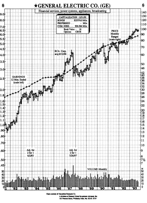
"A quick way to tell if a stock is overpriced is to compare the price line to the earnings line. If you bought familiar growth companies — such as Shoney's, The Limited, or Marriott — when the stock price fell well below the earnings line, and sold them when the stock price rose dramatically above it, the chances are you'd do pretty well."
The Peter Lynch Chart originated from charts Lynch used in One Up on Wall Street to size up stocks at a glance. He aligned $1 in earnings per share to $15 in stock prices — which is where the textbook Peter Lynch P/E multiple of 15 comes from. The chart is typically displayed on a logarithmic scale so percentage moves of equal size look the same regardless of price level.
How to read it. When the price line drops well below the earnings line, the stock may be undervalued. When the price climbs well above the earnings line, it may be overvalued. When the two lines overlap closely, the stock is roughly fairly valued by Lynch's standard.
The Peter Lynch Chart on this page automates the same comparison for any public company.
When to Adjust the P/E Multiple
The default 15× multiple isn't a universal law — it's a sensible starting point for a "typical" growth company. In One Up on Wall Street, Lynch grouped stocks into six categories, and each warrants a different multiple:
| Lynch's Category | Reasonable P/E | Why |
|---|---|---|
| Slow growers | ~10× | Mature, low-growth businesses (utilities, established industrials) earn a lower premium. |
| Stalwarts (medium growers) | ~10–15× | Reliable large-caps growing 10–12% a year — the typical Lynch sweet spot. |
| Fast growers | ~15–25× | Companies compounding earnings 20%+ deserve a richer multiple, often near their growth rate (PEG ≈ 1). |
| Cyclicals | varies sharply | Multiples expand at the trough and compress at the peak — the inverse of how it looks at a glance. |
| Asset plays | not applicable | Value lies in hidden assets, not earnings-multiple snapshots. |
| Turnarounds | not applicable | Use only after earnings recover; before that the chart is misleading. |
Practical workflow. Before using the P/E = 15 line as your sole signal, identify which category the company belongs to. A slow grower trading "below the P/E = 15 earnings line" may actually be fairly valued at P/E = 10. A fast grower trading "above the P/E = 15 line" may still be cheap relative to its growth rate. Use the chart as the first pass; categorize the business as the second.
Frequently Asked Questions: Peter Lynch Chart
What is a Peter Lynch chart?
A Peter Lynch chart overlays a stock's historical price against its "earnings line" — calculated as earnings per share × 15. When price sits below the earnings line, the stock is potentially undervalued by Peter Lynch's standard. When price is above the earnings line, the stock may be overvalued. The chart is named after legendary Fidelity Magellan manager Peter Lynch, who popularized this visualization in "One Up On Wall Street."
What is the Peter Lynch fair value formula?
Peter Lynch's textbook fair value formula is straightforward: Fair Value = EPS × 15. The 15 represents a fair price-to-earnings (P/E) multiple for a typical stable company. Some investors adjust this multiple — using 10 for slower-growing utilities or 20+ for fast growers — but Lynch used 15 as a default sanity check. Compare the calculated fair value with the current stock price to see whether the stock is trading at a premium or discount.
What is a good Peter Lynch ratio?
When price ÷ Peter Lynch fair value is below 1.0, the stock appears undervalued. Below 0.85 is often considered a meaningful margin of safety. Above 1.15 suggests the stock is overvalued. A ratio near 1.0 means the stock is fairly priced by this method. Always combine the Peter Lynch ratio with other valuation signals — Peter Lynch himself emphasized understanding the business, not just the formula.
How does the Peter Lynch chart differ from PEG ratio and DCF?
The Peter Lynch chart uses a fixed P/E multiple of 15 and focuses on earnings-line visualization. The PEG ratio (also a Lynch favorite) divides P/E by growth rate to adjust for growth. DCF projects future free cash flows and discounts them to present value, which is more rigorous but requires more assumptions. The Peter Lynch chart is the simplest of the three — useful as a quick sanity check, then narrow with PEG or DCF and Lynch's own categorization (slow growers, stalwarts, fast growers, cyclicals, asset plays, turnarounds) to choose a fairer multiple for that specific business.
How does GF Value compare with Peter Lynch's fair value?
GF Value is GuruFocus's proprietary intrinsic value calculation that incorporates historical price multiples, future business performance, and earnings quality. Peter Lynch's textbook fair value relies only on current EPS × 15. The two often agree directionally — when they diverge, it usually signals that Peter Lynch's formula is missing context like cash flow quality, debt load, or sector cyclicality. Use both as cross-checks rather than picking one in isolation.
Is Apple Inc (AAPL) currently above or below its Peter Lynch fair value?
At a current price of $333.02 versus a Peter Lynch fair value of $124.05 (EPS × 15), AAPL appears overvalued by Peter Lynch's textbook method. For comparison, the GF Value is $269.17, suggesting the stock is overvalued by that method. Use the chart above to see how the earnings line and price have moved together over time.
How do I read the Peter Lynch chart to make investment decisions?
Use the Peter Lynch chart as a first-pass screen rather than a final decision. Look for periods when price diverged below the earnings line and recovered — that pattern suggests the stock has historically responded to Peter Lynch's undervalued signal. Pair the chart with fundamental analysis: earnings durability, debt levels, competitive position, and management quality. The chart shows whether a stock is statistically cheap by one method, not whether it's a good business.
We'd love to learn more about your experiences on GuruFocus.com and how we can improve!
Take Survey
